

Power BI Report and Dashboard, as the name suggests, is a powerful Business Intelligence tool developed by Microsoft. Power BI June 2022 Feature summary to help you better understand what it can do.
1. Connecting to multiple data sources
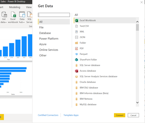
Latest one of many power BI features is connecting multiple data sources. The first step of the data analysis process is to obtain the data. When we click on the ‘Get data’ button on the ‘Home’ tab, it will show a wide range of available sources. The simplest option is from a file, which can be an excel workbook, a text/CSV file, a JSON file, etc. We can also connect to databases such as SQL Server database, Access database, … and many more. Some other options, such as Power Platform, Azure, or Online Services (ex: Salesforce), are also available.
2. Transforming data with Power Query
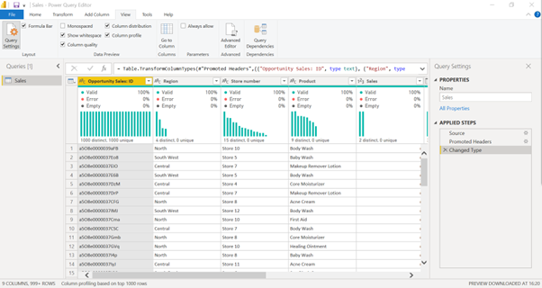
The obtained data will need to be processed before calculating and visualizing. In the Power Query window, a preview of the data is shown, and we can freely manipulate the data to fit our needs. Some basic operations include filtering the data, replacing values, changing the data type, creating additional columns, etc. We can also view the quality of our data to see if there are any blank values or errors.
3. Connecting data with the data model
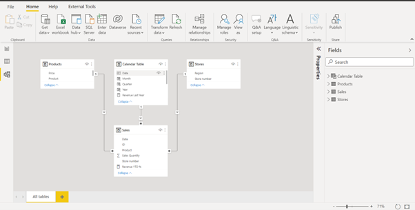
Data are/is often stored in many tables, with each table containing a different aspect of the data. In Power BI, we can create relationships between tables to create a data model. The relationships only need to be created once; then, we can get information from all the connected tables each time we perform a calculation.
In the sample data model below, to calculate revenue, we can simply take the Sales Quantity from the Sales table and the Price from the Products table since the two tables are already connected by a relationship.
4. Creating complex calculations
Power BI uses the DAX language that comprises formulas and expressions for data manipulation.
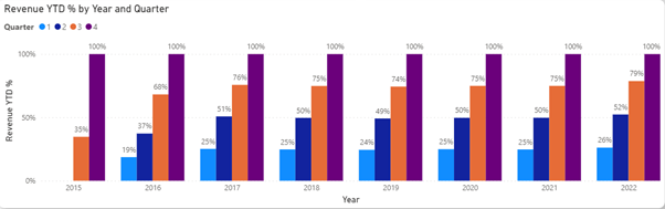
For example, if we need to show how the revenue has increased through each quarter of the year, instead of calculating the revenue manually for each quarter, we can use the TOTALYTD (year to date) function, which will calculate the total revenue from the beginning of the year up to the specified quarter.
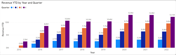
We can also divide the year-to-date number by the total revenue of the year to show the percentage for easier comparison.
Instead of calculating these numbers manually in an excel sheet, we only need to create a few calculations, or measures, as they are called in Power BI, and then apply them to many different scenarios.
5. Creating visualizations
Power BI offers a wide range of visualizations. They can be found on the visualizations pane on the right side. The core visualizations include:
- Bar chart, column chart, combo chart (column and line): these charts are often used to show the trend
- Donut chart and pie chart: to show the percentage
- Gauge chart and KPIs chart: to measure progress toward a goal (power bi goals feature)
- Funnel chart: to visualize a process with different stages
- Maps: to display geographical data
- Table and Matrix: to display detailed data
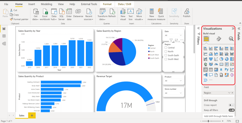
There are many more visualization tools included. In addition, we can also download custom visualizations or create our visualizations to meet our needs.
6. Interacting freely with the report
In Power BI, we can get the data view we need in one of two ways.
The first is using Slicer – a visualization tool used specifically for filtering data on Power BI reports.
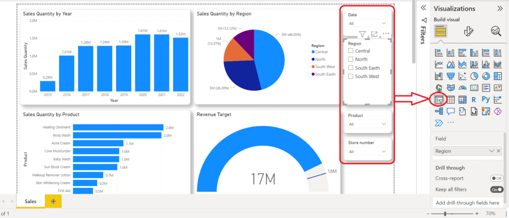
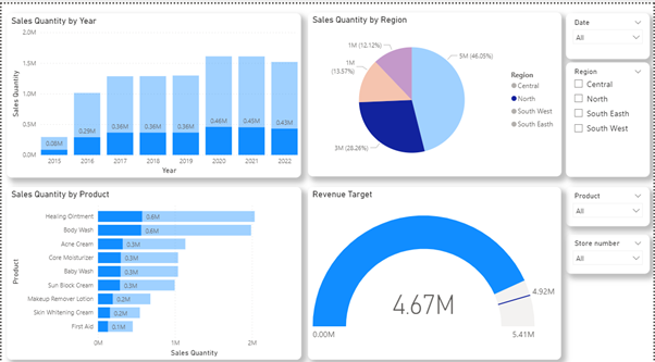
The second is using the cross-filtering function by clicking on the visualization.
For example, to view only sales data for the North region in our sample dashboard, we can simply click the part of the pie chart representing the North region, and the other charts will filter accordingly.
7. Sharing Power BI reports
After the report is created, it can be shared with others through the Power BI service.
A function called Row Level Security, or RLS, can be used to ensure that each person only sees the data related to them. It helps to avoid creating multiple versions of the same report.
There are also other functions, such as email subscription to a report or a dashboard, so we can receive information on a schedule that we set, or mobile version, so that we can view the report/dashboard on mobile devices.
Hopefully, this article gives you a general understanding of Power BI and its functions. This tool has so much more to offer, and we will continue to explore them in future articles.
Learn more about Trueson Data & Analytics Services here.
Talk to our BI consultants TODAY to optimize your reports and dashboards.


